Prior to the development work that brings your application idea to launch, all of the above terms represent a step that is beneficial or completely necessary in getting off the ground. When kicking off with design and development, these words are not interchangeable, though the differences can be hard to spot if you’re hearing them for the first time. A sketch, wireframe, mockup, and prototype are all unique ways to visually display the requirements of your application with varying levels of detail. Understanding that level of polished output each of these present will keep expectations aligned and communication clear between you and your creative or technical talent.
Sketch
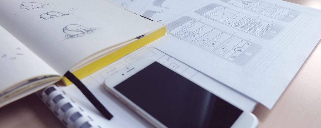
Starting with the least detailed of the bunch, a sketch is a simple visual to help explain an idea quickly. There aren’t really any rules to follow here. Typically this is an idea that is in the beginning stages, with only a direction in mind, where frequent adjustments will follow. Portraying just enough to get a thought across, a sketch doesn’t require an investment of energy talking through specifics and instead is kept ambiguous to facilitate further discussion. When discussing ways to jazz up empty screens for our partner, Trunq, sketches were the natural option. With a sketch, the designer was able to communicate a potential solution that could be built on later to form a refined design or thrown out without compromising too much time spent if it missed the mark completely. Since a sketch is a more casual format and doesn’t necessarily require an artful hand, our partners often send along a free hand drawing that they have made to share their ideas with us.
A sketch is:
Detail-free- conveying the concept at the highest level
Disposable- little time invested and really only used as a tool for facilitating conversation.
Wireframe
Like a sketch, a wireframe is a way to illustrate information so that it can be understood quickly and clearly, at a glance. Decisions are still being made and ideas solidified so jumping right into the design wouldn’t be an efficient way to handle frequent changes. Besides, this isn’t a design exercise where colors and fonts are important, although the look and feel of layouts as it relates to the user interface (UI) play a part. Standard icons are used and the color palette remains mostly black and white. The overall goal is to create a detailed plan outlining what each page or screen will include from a functional standpoint. This includes how content is grouped or arranged, the ways that information will be structured, and how elements will work or interact with one another. With wireframes, there are two audiences: technical and non-technical. They should be digestible by those attached to the application that may not have a background in technology, as well as comprehensive enough to answer questions that a developer or software architect would have. Just as you wouldn’t build a house without blueprints, wireframes are a step that should never be skipped when developing an application.
At FarShore we create wireframes mandatorily as part of our Phase 1a, a preliminary engagement we complete as part of our onboarding process in an effort to document the project requirements in detail with a defined scope, extend an accurate estimate, and select a project structure. Without wireframes and the at-length discussions that go into their creation, the understanding of the project’s needs may be vague or even misunderstood. Wireframes take the guesswork out of the estimation process and answer important questions up front, allowing the ability to troubleshoot proactively.
A wireframe is:
Validating- beginning to turn the idea into reality, a wireframe starts to tackle the how and why of the ways the application will work.
Valuable- setting the tone for the development and design work to follow
Mockup
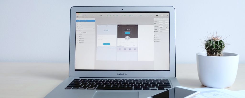
Often confused with wireframes, mockups aren’t used in scoping functional needs but are drafted designs that focus on the visual aspects of the screens or pages. You could think of mockups and wireframes as opposites where one decides the bones and one decides the skin. Mockups are a step up from the low fidelity nature of wireframes and essentially fill in the blanks with typography, color palettes, custom iconography, and photo imagery. While not interactive, a mockup communicates everything a static screen can using visuals. This may include dummy text or fake profiles to illustrate the appearance of a live application. These designs can be incorporated into presentations or marketing documents for potential investors and are a great way to gather feedback for the design or concept of the application, as it is a step closer to the final product. There is flexibility here as any feedback that is received at this point in design can be updated quickly in comparison to making changes later when already in the code. Ultimately, the design file of the mockup can be the applied design of the application.
A mockup is:
Sales material– shows better in presentations or marketing materials than cut and dry wireframes
Static– serves only to show a visualization of the screen(s) until it’s applied at a later time
Prototype
Moving away from the previous three fixed examples and into usability, a prototype offers the first ability to interact with the elements of the application. One of our favorite tools for presenting designs as a prototype is Marvel, which doesn’t require code work but takes design files allows them to be organized in a way that features areas that can be selected by a user to walk through the experience of the application as if it were live. The goal a prototype is to be a simulation of the final experience including the sequence of screens/pages and how a user navigates them in real time. Prototyping is not a requirement when designing and developing an application, although similar to mockups it may be beneficial during presentations or when seeking outside investment.
A prototype is:
Interactive: closely resembles the end experience without requiring development
Inessential: a step that may be good to have, depending on your marketing and sales strategy but is not necessary for every application
Each of the above steps builds off of the one before it, gradually becoming more refined. While none of these are meant to stand alone as an end product, they can all be suitable tools that lead to successful applications.
If you have an application idea in the beginning stages, sketches, wireframes, mockups, and prototypes may be helpful vehicles to get your point communicated efficiently between audiences or team members. Reach out to our team to learn more about the Phase 1a process and how to select the method that best suits your project’s needs.
Sky is the Managing Director of US Operations. Her role, which focuses on ensuring cross company quality of operations, pulls from her background in operational organization within IT and Professional Services. After graduating with a Bachelors in Marketing from Columbia College Chicago, her passion for the ways in which every business can benefit from technology led her to a career at FarShore.


… [Trackback]
[…] Find More Informations here: farshore.com/blog/what-is-the-difference-between-a-sketch-wireframe-mockup-and-prototype/ […]