Mobile applications are growing in number by day and mobile usage is skyrocketing. App design trends are moving quickly but rarely just disappear in a year, instead of fading over time. We can still see some of the trends from 2017 continuing into this year. Here are some of the popular design trends that will continue to evolve throughout 2018.
- Rich Colors
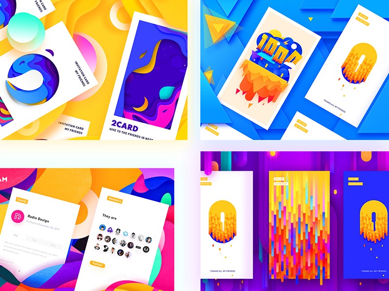
Colors have always been a designer’s favorite tool when creating eye capturing interfaces. Colors inspire, set the mood, and draw attention. There was a long reign of pastel and flat colors, but ever since the Google material design and Instagram’s redesigned icon we are starting to see brighter and more vibrant colors, gradients, duotones, and shadows. This semi-flat or flat 2.0 trend will continue this year as well, and we can expect to see richer, high contrast color transitions and complementary colors.
Image from Dribbble by Frannnk
- Custom Illustrations
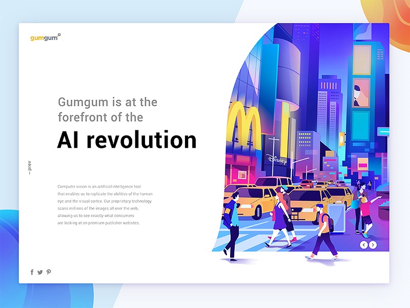
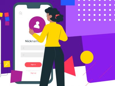
Illustrations are growing in popularity, and having a custom-tailored illustration in your app or website has become almost standard. Illustrations are widely used for onboarding and as an added value to the app. Many large companies have seen the value of illustration, including Google, Slack, and Dropbox with its latest rebrand where they included a set of new illustrations as a vital part of their new identity. So, when looking for design ideas for your next application, consider joining this growing trend by mixing in a cool illustration that will speak about your brand.
Image from Dribbble by Leo Natsume
- Personalized Content
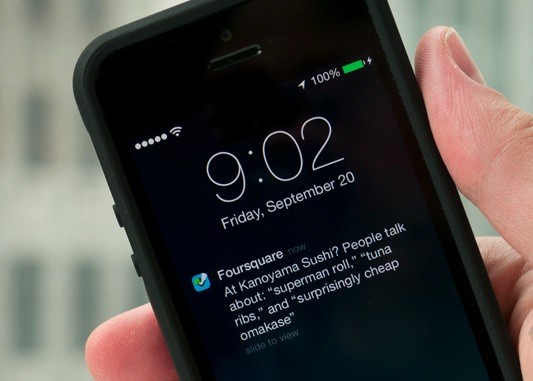
Tailoring content to a specific user’s needs attracts people with unique interests from different places and people will keep coming back to the app as it gives them content they need and are interested in. Facebook, Amazon, YouTube, Netflix, Goodreads are just some examples of successful well-known companies that use personalized content based on user actions to keep users engaged. Starbucks utilizes personalized, geolocation-based marketing (so-called geofencing) to notify users about specific offers specifically tailored for them. Foursquare also started to use this kind of marketing many years ago. These machine learning systems are changing user experiences based on individual users and companies will keep exploring this into 2018.
Image from VR Zone.
- Simplification
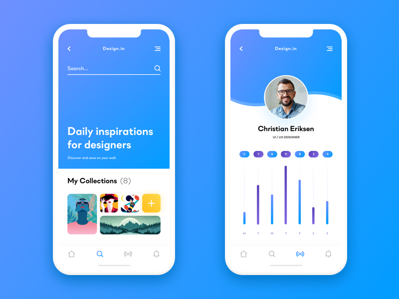
Minimalism and white space are always seen in graphic design as elegant and timeless, and it’s a well-known trend in the web and mobile industry as well. In 2018 it’s expected that this trend will spread and intertwine with the personalized content trend. Clear visual language without noise will place content first, which has always been the UX designer’s goal. Essential for achieving this effect will be meaningful content, large titles, bold colors and beautiful imagery. Design simplification will declutter the app and emphasize the content within the app so users can focus on their goals.
Image from Dribbble by Filip Legierski
- Micro Interactions
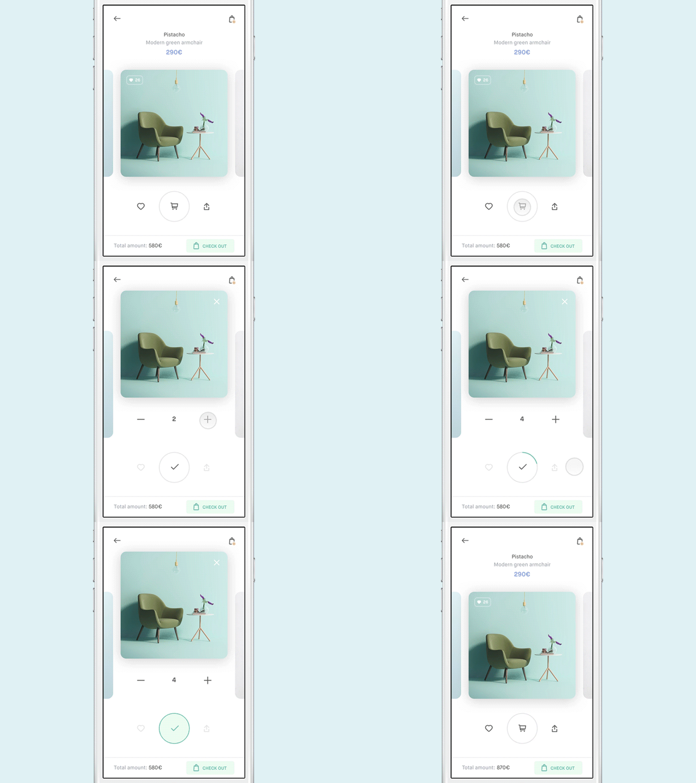
Micro-interactions are visual feedback from the app to an action that user takes. This can be small animations like a transition, bounce, swipe etc. People will notice the movement and be incorporating this into the app can highlight specific areas or products. However, make sure it’s not too much as the best performing interactions are seamless, effortless and clever. They can make users feel like they are manipulating the interface which is responding to their actions. Such details are also what separates one app from the other and bring it to the next design level.
- Add to Cart micro-interaction by Alberto Conti
- AR
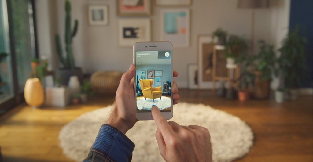
Who would have predicted that augmented reality would spread to the mobile world? Not only spread but become so popular that it changed lives, which is easily shown by the Pokémon GO frenzy which cleared the path and had an enormous effect on the AR software market. According to Juniper Research in 2016, AR app downloads will by 2021 hit around 2.3 billion which is a 380% increase. As per Statista AR is expected to reach a market size of 215 billion U.S. dollars by 2021. With new devices that support AR and with the launch of Apple’s ARKit and Google’s ARCore in 2017, developers have access to frameworks for creating AR apps. Industries like gaming, travel, education, and e-commerce are starting to use AR and its usage will only grow further in 2018 as new and existing businesses see opportunities in popularity of this technology.
Image from Ikea.
- No Hamburger Menu
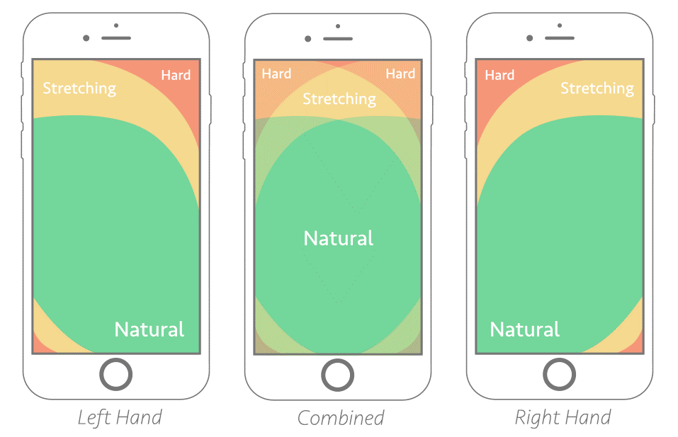
For years we have seen the domination of hamburger menus. Those all too familiar three little lines at the top left corner of your mobile app. To the delight of many designers, this is finally starting to change! Footer menu is back big time and it’s looking better than ever. With new 16:10 aspect ratio, designers have additional space to work with and the footer menu has returned to fill in that spotlight, bringing with it benefits to the user experience. Hamburger menus were less easily reached and users had to tap on the icon to reveal the menu. Footer menus offer “instant navigation” because elements are always visible. There was a discussion about footer menu usability on Android devices where footer menus could clash with the bottom system bar. Users could accidentally tap a system button instead of footer app navigation, but Google explained correct usage of bottom navigation in their material design guidelines.
Image from Smashing Magazine
It’s in the nature of trends to come and go, while good ideas stay and evolve. For instance, flat design has been on the scene for a while and most of us are excited to see it change into something new. Times are coming when old trends are coming back, but better and with more originality, to merge with recently ruling trends and turn them into new and exciting patterns. In 2018 we’ll see some new trends emerge and as a designer, I can’t wait to see all the creativity that this year will come up with!
Do you agree with the list above? Let us know in the comments. And while you’re at it, check out our Behance and Dribbble pages. For the full case study pages visit our website.
Lucija is FarShore’s Team Lead, managing team’s daily tasks and working on UI designs for all types of projects. Her interest in UI/UX, graphic communication and illustration has been evolving ever since the beginning of her secondary education at School of Applied Arts and Design. As a culmination of this interest, in March 2012 Lucija obtained Master degree in graphic technology at the Faculty of Graphic Arts in Zagreb.




Great article. Thanks for sharing!
It covers all the important trends, which are definitely going to be booming this year. Great Piece of information.
[…] while using the app. What app designers often forget is that privacy regulations intervene with the ideal user experience, which is crucial when the users have an app in their hands for the first […]